The BrightMail Analytics Dashboard was built to provide insights into the performance of a fictional SaaS company offering an email newsletter product. The dashboard, developed using Tableau Public, visualizes key performance indicators (KPIs) to help businesses track their financial health and customer dynamics more effectively.

What the Dashboard Shows
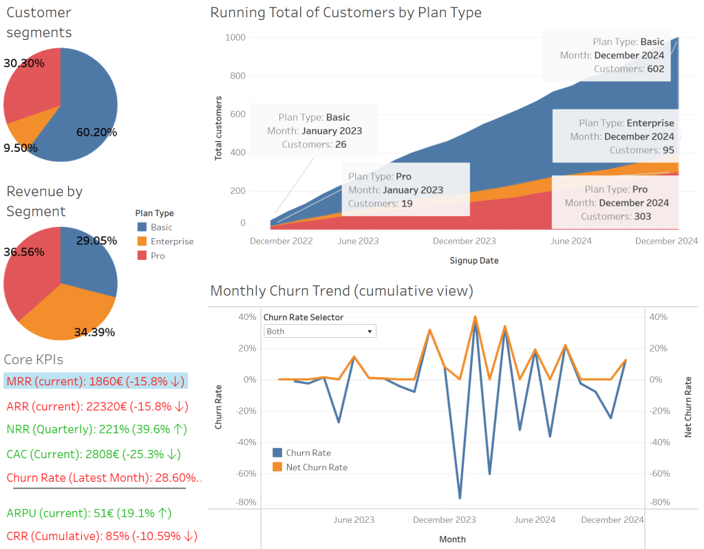
The BrightMail Analytics Dashboard tracks several important business metrics:
- Customer Segments and Revenue Breakdown:
- A pie chart displaying the distribution of customers across Basic, Pro, and Enterprise plans.
- A second pie chart showing the revenue contribution of each segment, emphasizing the revenue impact of higher-tier plans.
- Cumulative Customer Growth:
- An area chart showcasing the cumulative number of customers segmented by plan type over time.
- Churn Rate Analysis:
- A line chart showing monthly churn trends to help identify retention challenges and seasonal patterns. (You can also choose between a simple churn rate and a net churn rate, which avoids negative churn.)
- KPI Summary Card:
- A summary of the most critical SaaS metrics, including:
- Monthly Recurring Revenue (MRR)
- Annual Recurring Revenue (ARR)
- Net Revenue Retention (NRR)
- Customer Acquisition Cost (CAC)
- Churn Rate
- Average Revenue per User (ARPU)
- Customer Retention Rate (CRR)
- A summary of the most critical SaaS metrics, including:
Each KPI is color-coded for clarity, with green indicating positive performance and red flagging areas that may require attention.
Key Insights from the Dashboard:
- Revenue Optimization: The revenue breakdown reveals that while Enterprise and Pro customers make up around 40% of the customer base, they generate approximately 70% of the revenue, highlighting the importance of higher-tier plans.
- Retention Trends: The churn rate chart helps identify months with higher customer drop-off.
- Customer Growth: The area chart offers a view of growth patterns across all customer segments.
How I Built It:
The dashboard was developed using Tableau Public, incorporating calculated fields and fixed level-of-detail (LOD) expressions to ensure accuracy in data presentation. The dataset was simulated but designed to mirror real-world SaaS business dynamics, including seasonal variations and customer behavior trends.
Who Can Benefit From This Dashboard?
This dashboard can be useful for:
- SaaS companies seeking insights into revenue streams and customer behavior.
- Small businesses looking to track customer acquisition costs and retention metrics.
- Anyone who wants to see how you can build a functional dashboard in Tableau Public.
I have uploaded the simulated data to my GitHub repository for anyone interested in building their own dashboard with that data.